Growing a Product Through Continuous Design
Helped transform Stasher's digital experience over four years by redesigning its ecommerce ecosystem, improving conversion, and building scalable systems that grew with the business.
Senior Digital Designer → Digital Art Director • E-commerce • 2019–2023
When I joined Stasher, the product had already built a loyal following, but the digital experience hadn't kept pace with the brand itself. Over the next four years, I helped redesign nearly every part of the customer journey, from the website and product pages to email, social, and campaign launches.
What started as a series of redesigns gradually became something much bigger. As the business grew, I found myself thinking less about individual pages and more about how every touchpoint could work together as a cohesive system that would continue evolving alongside the company.
Build for What’s Next
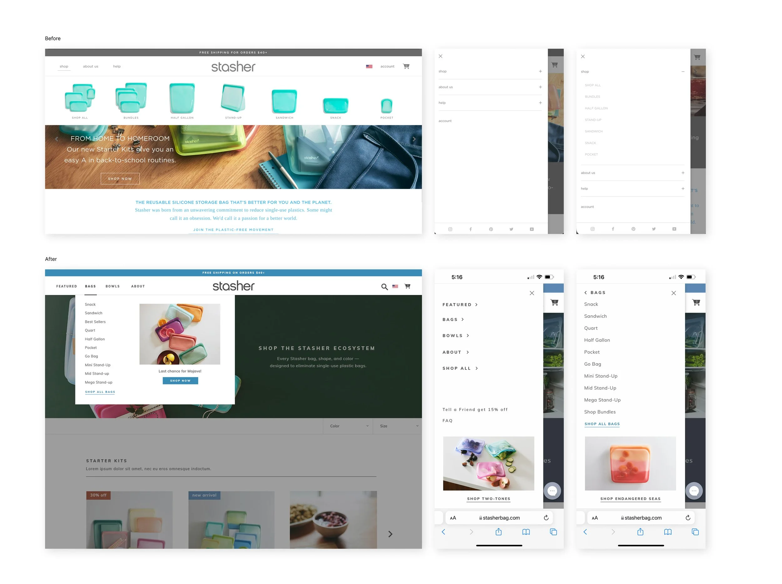
The moment we started planning for the Beauty bag launch, it became obvious the navigation was not built for where the business was headed. It had worked well when the product catalog was smaller, but adding an entirely new category exposed the limits of the site's structure.
Rather than simply finding room for another menu item, I saw it as an opportunity to rethink the navigation from the ground up. I looked at a broad range of e-commerce navigation patterns, explored multiple directions, and worked closely with engineering to understand the development effort behind each approach before refining the final solution.
Once we landed on a direction, we planned for what would happen after launch. We introduced analytics, watched how customers actually used the navigation, and continued refining it based on real behavior. One small addition, a featured product area inside the navigation, became one of the most engaged-with elements and gave the marketing team a flexible way to highlight launches without redesigning the experience each season.
Looking Back
Looking back, I do not think the navigation redesign was really about navigation. It was the first time I experienced how quickly a growing business can outgrow the systems that once worked perfectly well. Since then, I have found myself asking a different question at the beginning of projects: Will this still make sense a few years from now?

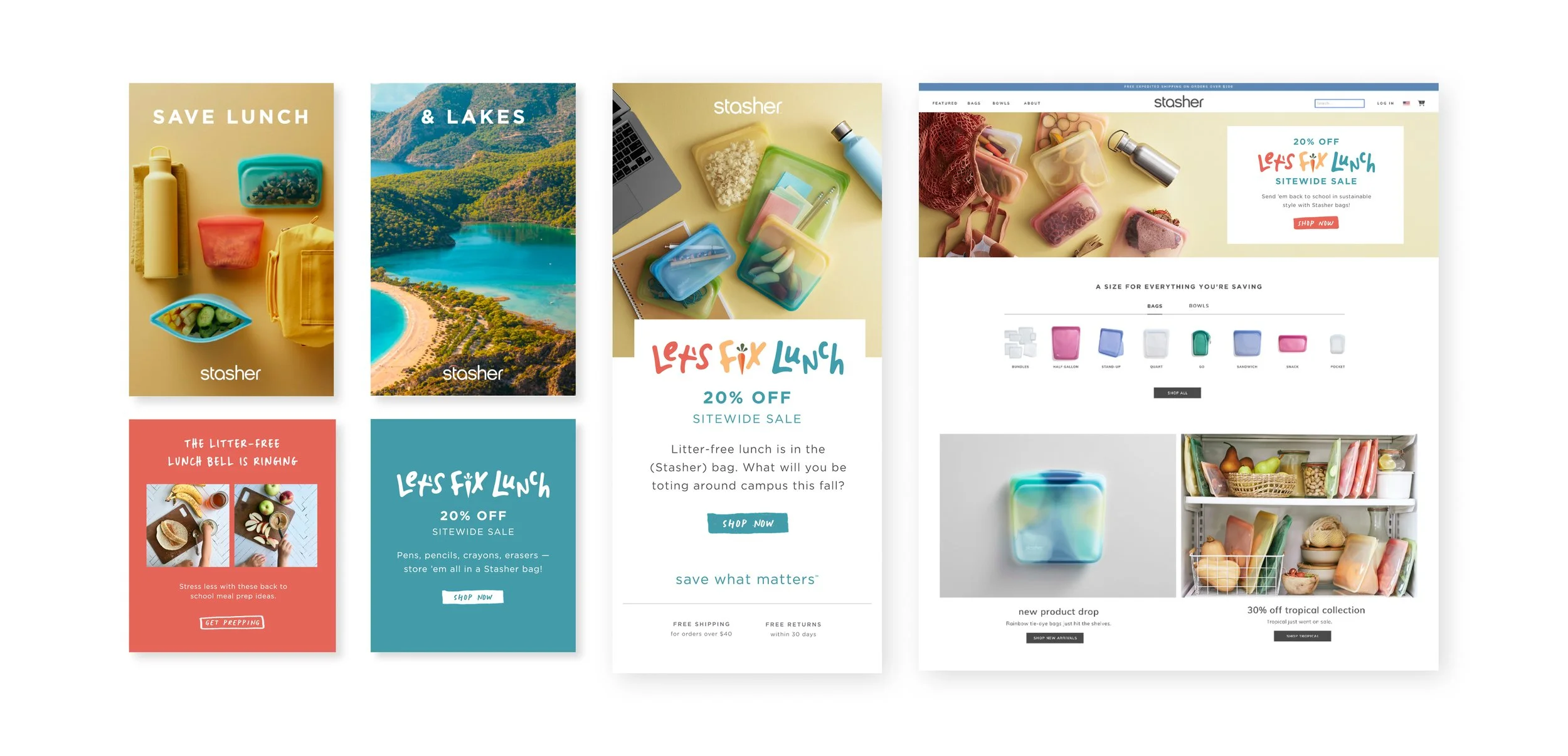
Repetition is an Opportunity
At one point I realized we were rebuilding the same layouts over and over again. Every campaign started from scratch, every landing page required another custom solution, and every update asked engineering to solve problems we'd already solved before.
Instead of continuing that cycle, I partnered with engineering to build a library of reusable website sections that could be mixed and matched across the site. Marketing gained the flexibility to launch new campaigns quickly, development became more efficient, and the website became much easier to evolve over time.
Around the same time, I led our migration from Adobe Creative Suite to Figma. Getting buy-in wasn't really about introducing a new tool—it was about showing the team how reusable components, templates, and shared standards could remove repetitive work and make collaboration much smoother.
Looking Back
I don't remember the day we finished the design system. I remember the moment people stopped asking for the same files over and over again. The system quietly became part of how the team worked, and that's when I realized the best design systems almost disappear into the background.
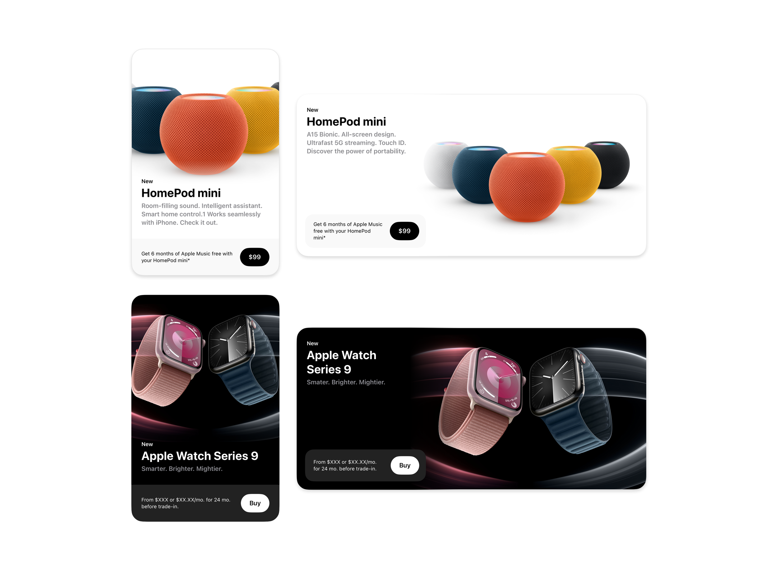
Design Doesn’t End at Handoff
Creating the system was only half the project.
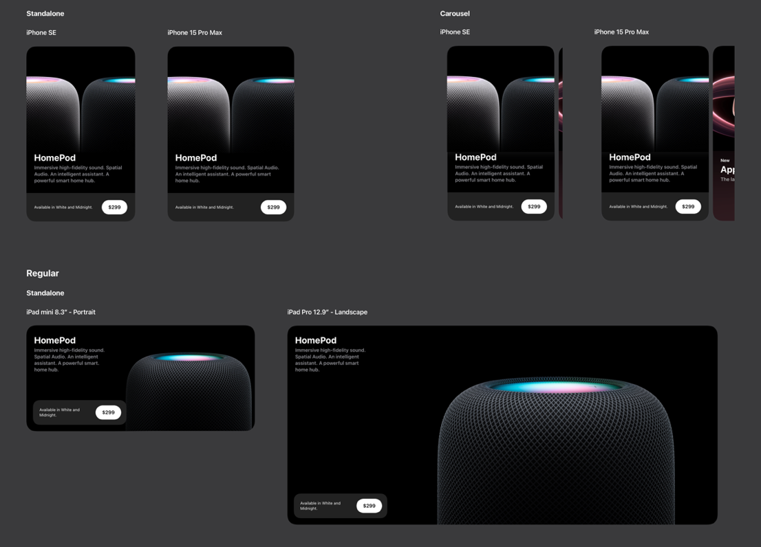
The hero cards would ultimately be used by many teams across future product launches, so the system needed to be just as easy to use as it was to build.
To support that rollout, I created detailed templates, including complex components, and documentation that explained how the system should be used across different scenarios. I also introduced the templates to the broader design studio, walking teams through the reasoning behind the decisions and helping establish a shared workflow for future launches.
I remember thinking that the project would only really be successful if another designer could pick it up six months later without needing me to explain how it worked. That became the benchmark I used while building the templates and documentation.
Looking Back
I still think about this project whenever I'm handing work off to another designer. It changed my definition of "done." Shipping the design wasn't the finish line. Knowing someone else could confidently use the system without me in the room was.
Collaboration
Because the hero cards sat at the intersection of design, engineering, and product marketing, nearly every decision required close collaboration.
Throughout the project, I partnered with engineers to work through implementation details, product teams to understand storytelling goals, and designers across the studio to make sure the system remained intuitive as it rolled out for future launches.
Looking back, I think that's one of the reasons the project was successful. Everyone approached it from a different perspective, and the final system ended up stronger because of those conversations.
Outcome
The redesigned hero card system established a flexible foundation for showcasing future Apple product launches while maintaining consistency across devices, products, and teams.
Beyond the launch itself, the project created reusable templates, documentation, and workflows that helped other designers confidently adopt the system and continue evolving it over time.