Building a System for Product Storytelling
Led the redesign of the Apple Store app's hero cards, creating a scalable design system that balanced creative flexibility with consistency across products, devices, and future launches.
Lead Product Designer • Product, Engineering & Design • Apple Store App

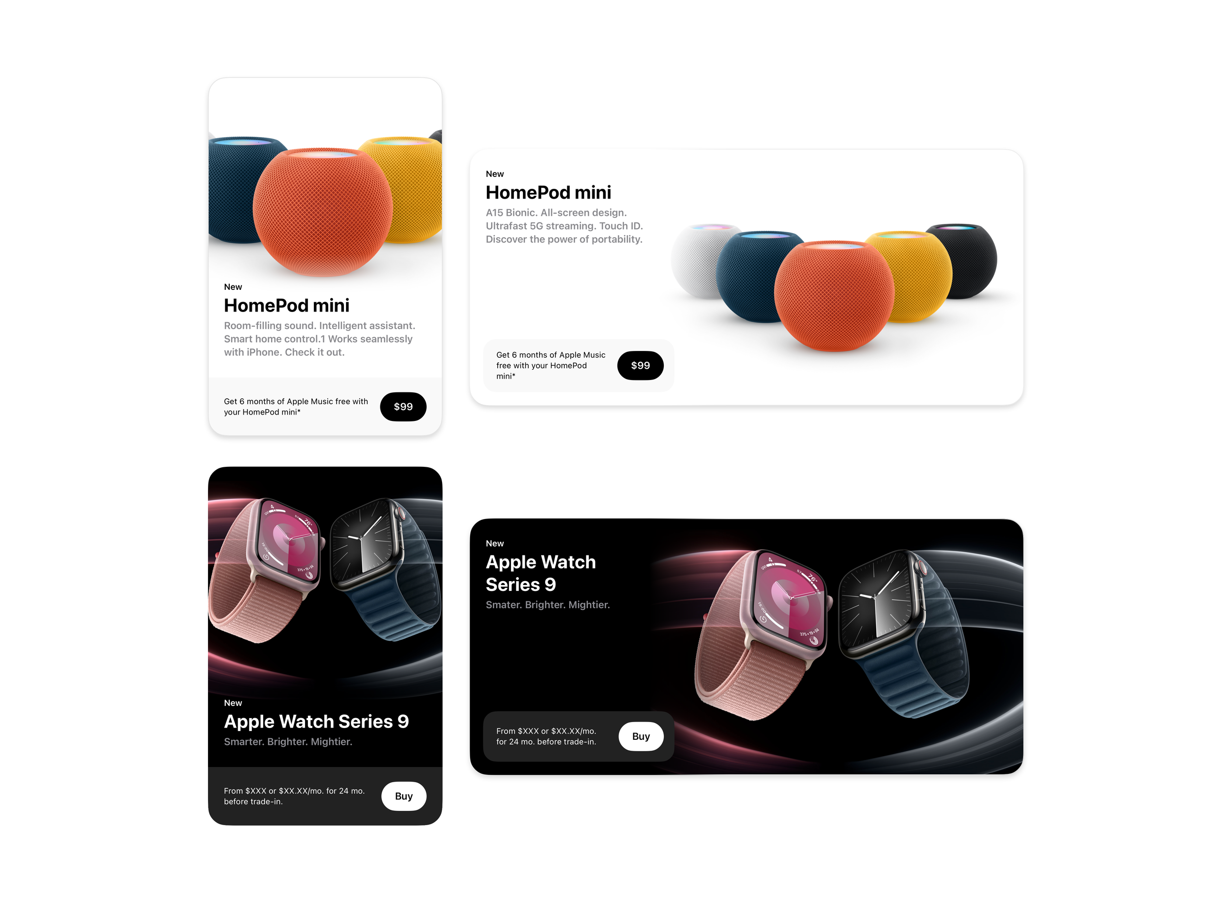
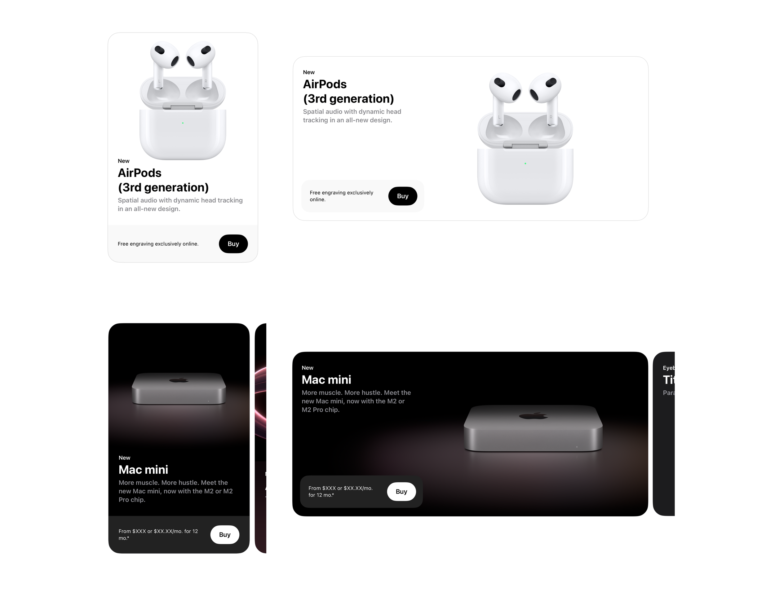
As part of a broader redesign of the Apple Store app, I led the redesign of the hero cards—the first thing customers see when they open the app and one of the most important storytelling surfaces in the experience.
At first, it sounded like a visual redesign. It quickly became clear it was really a systems problem.
The cards needed to work across iPhone and iPad, adapt to future product launches, support a wide range of imagery, and give product teams enough creative flexibility to tell compelling stories without sacrificing the consistency people expect from Apple.
The result was a flexible system that continues to support new launches while giving teams clear guidance on how to build hero cards that feel cohesive, polished, and unmistakably Apple.
Designing for Many Designers
One of the biggest challenges wasn't deciding what the hero cards should look like. It was designing a system that other teams could confidently use long after the project was finished.
Each card consisted of copy elements, background colors, gradients or textures, and of course the hero image. Giving teams complete freedom across these elements would quickly lead to inconsistency, but restricting them too tightly would limit their ability to highlight each product's unique qualities.
To solve this, I defined a structured set of options across each variable within the card. This included curated background treatments, color systems, and layout patterns that teams could choose from depending on their product and narrative. Over time, I realized the goal wasn't to design every possible hero card. It was to create a framework that let teams be creative while still maintaining design unity across every launch.
Looking Back
Before this project, I thought of design systems mostly as a way to create consistency. Working on the hero cards made that idea feel much more tangible. Because different teams were creating content independently, often without direct coordination, the structure of the cards became the thing that held everything together. Even with variation in imagery and storytelling, the system ensured the final experience still felt unified.
Every Edge Case Matters
Designing the hero cards meant thinking well beyond the ideal mockup.
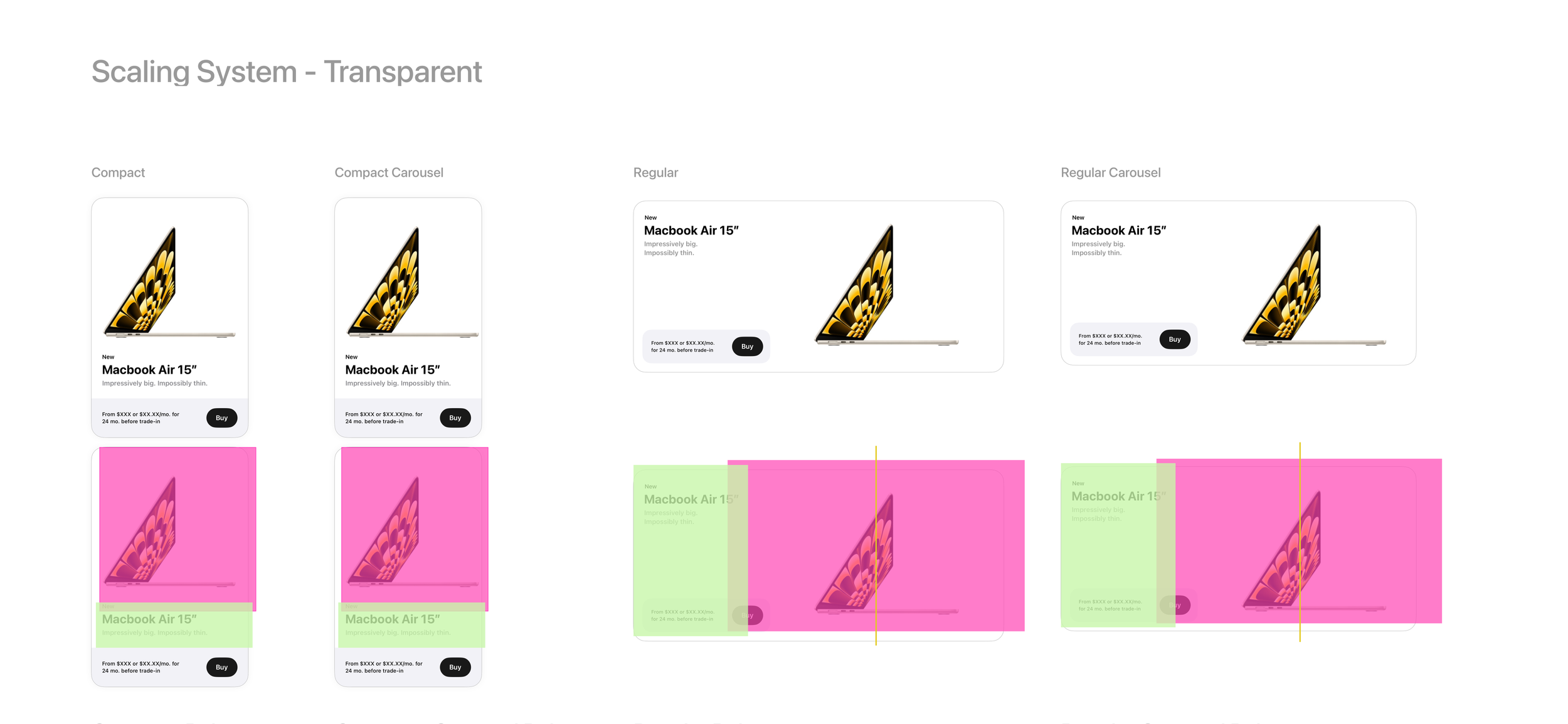
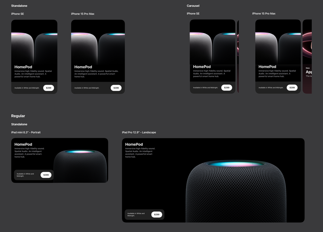
The cards needed to work across vertical and horizontal layouts, support both iPhone and iPad, accommodate a wide range of product imagery, respect Apple's guidelines around how hardware could be presented, and flex for accessibility requirements.
One of the most technically challenging parts of the project centered around image behavior. We spent a surprising amount of time working through the exact behavior of the imagery. Small decisions around scaling, positioning, and cropping had to work consistently across every device while still maintaining the approved image crop.
Working closely with engineering, we refined those behaviors through countless rounds of edge case testing until the system felt predictable, reliable, and almost invisible. Those conversations often came down to tiny calculations, but getting them right made the entire experience feel effortless.
Looking Back
Looking back, this is the project that taught me how much good design happens outside the design file. Some of the most important decisions came from sitting with engineers, talking through edge cases, and working together until the solution felt obvious. Those conversations shaped the final product just as much as anything I designed.
Design Doesn’t End at Handoff
Creating the system was only half the project.
The hero cards would ultimately be used by many teams across future product launches, so the system needed to be just as easy to use as it was to build.
To support that rollout, I created detailed templates, including complex components, and documentation that explained how the system should be used across different scenarios. I also introduced the templates to the broader design studio, walking teams through the reasoning behind the decisions and helping establish a shared workflow for future launches.
I remember thinking that the project would only really be successful if another designer could pick it up six months later without needing me to explain how it worked. That became the benchmark I used while building the templates and documentation.
Looking Back
I still think about this project whenever I'm handing work off to another designer. It changed my definition of "done." Shipping the design wasn't the finish line. Knowing someone else could confidently use the system without me in the room was.
Collaboration
Because the hero cards sat at the intersection of design, engineering, and product marketing, nearly every decision required close collaboration.
Throughout the project, I partnered with engineers to work through implementation details, product teams to understand storytelling goals, and designers across the studio to make sure the system remained intuitive as it rolled out for future launches.
Looking back, I think that's one of the reasons the project was successful. Everyone approached it from a different perspective, and the final system ended up stronger because of those conversations.
Outcome
The redesigned hero card system established a flexible foundation for showcasing future Apple product launches while maintaining consistency across devices, products, and teams.
Beyond the launch itself, the project created reusable templates, documentation, and workflows that helped other designers confidently adopt the system and continue evolving it over time.